Haha, sorry couldn't resist the Star Wars link, I meant to type:
A New Beginning
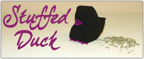
I've made a start on my new design and so far I'm loving it! I really love my little stuffed duck but as it was made of black fabric it just doesn't stand out enough. Instead I have decided to take the scene and redesign it in photoshop. I really enjoyed making the recent Titwatch banner so wanted to keep the same style; a bright and colourful vector image with a bold font to stand out. I chose to colour the duck yellow, but I loved the purple accents so I've kept those, I also added an eye as it looked a little weird without one. I still wanted my duck to be stuffed but it's now a lot easier to demonstrate this with lavender sticking out of his back. I'm really pleased with the lavender it looks so pretty may have to use this design elsewhere. This is my favourite style of drawing so I hope to continue it throughout all my designs.
So I shall say a fond farewell to my old header...
And I hope you like the new one; I think you will agree it is a lot more colourful and fun!!

Recently on blogger we have also been given the option to add our own Favicon to our blogs; check it out my little duck is up there too, she is so cute!!

Another development is from now on I plan to watermark all of my photographs. I thought long and hard about doing this; I'm not so worried about protecting my work, but I want to get my name out into the big wide world and when people see my images they will know where they are from.

I've also been playing around with border styles, to jazz up my photos a bit more, tell me what you think; is it just too much? Or should I make them stand out more??
I love the new design. It's quirky and cute, yet quite sytlish as well. As for border designs, I'd keep it fairly simple. I hate when i can't find what i'm looking for because the website has chaged layotus around so that it doesn't make sense!
ReplyDelete